Modals Styles
Basic Modals (Nifty Modals)
Modal disables the original page beneath the overlay. The user needs to take an action or cancel the overlay until he can continue interacting with the original page. Modal are easy to implement, but they should be used sparingly. They interrupt the user flow, make it impossible to interact with the page and the overlay at the same time, and hide the content behind the overlay. This can be very annoying to users.
Position
There are four direction for the modal slider in from the page screen. when you click the button of each preivew image below, you will see the relevant modal demo.
Top

Center
Bottom
Sidebar

Form Modal
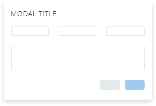
This modals including title, input for each field.
Multiple Modals
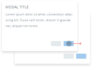
There is a new modal displayed overlay the first one by clicking the function button.
Optional Sizes
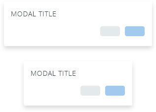
This modal has multiple size dialog for you to choice.
Tab In Modal
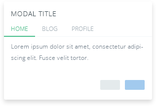
This modal including title, tabs for you display additional content inline in the same modal.
Accordions In Modal
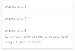
This modal with accordions to have additional content hidden until the user needs them.
Grid In Modal
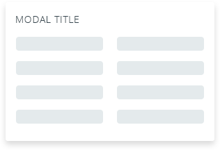
This modal including title and grids to layout through a series of two columns that house your content.
Styles
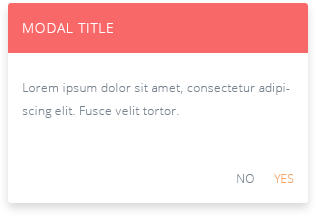
We provide six color options for modal title background color.
Choose color generate:
Fill In

This modal zooms from the middle and fills in fill-in to the modal.